About Eurocarparts
Eurocarparts, one of the biggest UK distributor of car parts and accessories, with around 200 locations in Europe.
Aside their extended their existing delivery, click and collect services there si an ongoing need of a new “Buy and install” package service. Under a series of customer requests and competition analysis, they’ve decided to create “fit it to for me” business by offering fitting quotes price right from the shopping basket (mobile & web).
This service allows you to buy car parts online and then choose a local approved workshop to fit it. The online service allows you to choose from your closest car workshop or from the workshop labour prices to fit your selected part. After choosing the garage workshop and time, you will then only pay for the part you have ordered online.
The Goal
Create a journey for 'Fit it for me' service and seamless integration with the current basket
Make a seamless basket integration with the current experience, without changing the current flow and conversion
As other competitors created a different product, with a different name and platform, we aimed to have the flows piggybacking the current ecomm journey of the main website.
The concept gives an option to users to get their parts fitted directly from the basket page, up-sell the fitting price, option select and deselect parts while reviewing the total price, select the closest workshop to user's postcode and book a time slot.
Team Structure
We were pleasured to work really closely with the ECP team, they were so nice to come 2 days per week in Biglight’s offices and be with us across the lifespan of the project. This helped us shortne the feedback loop and get a good understanding of the tech and business needs.
Time
3 months
4 Client Workshops
1 User Testing Session
My Role
Research
Wireframing
Client Presentation
User Testing
Visual Design
Team:
UX/UI Designer (Me)
User Researcher
Project Manager
Brand Designer
Tools:
Sketch, Figma
Notion
Miro Board
Principle App
Roadmap
- Define Audience & User Personas
- Research & competitor analysis
- Main User flow, validate with the tech team
- Define the happy path (wireframes)
- Tackle edge cases
- Visual Design (via DS)
Process
Workshops
The first thing was to understand as much as possible the nature of the business. My aim was to absorb any bit of information, to try to put myself in each others shoes and see the different perspective and understand their goals.
So I lined up some of the key people from Eurocarparts: a business executive, their logistic director and head of product design. From our agency side, we grouped our main researcher, visual designer, project manager and client account manager.
Design
In order to speed up the whole process we decided to create unbranded grayscale wireframes in order to focus on the functionality while we tested the prototypes.
Prototyping
For prototyping I've used Principle, a tool that helped us to wire together the wireframes from Sketch. One unique feature in this software is that I could create all sort of complex interactions in the same screen. One good example is to show how the fitting price range adapted to the product selected in the basket (we will get to this example later)
User Testing
For testing, we used our onsite testing facility at Big light. We had ten car owners that tested two hypotheses. I've made two prototypes each with a couple of slight variations that we wanted to test.

Audience & User Personas
It was interesting to discover that there is a shift in the customer demographic of the car owners. This generation has more money on their hands but they are at the same time pretty time and price aware. They prefer to save money to buy a new gadget for example rather to willingly pay lot's of money on a service.
Car ownership model is changing at a different pace so a car is less and less desirable to actually own, this is affecting how much money customers would spend on fixing and fitting their cars.

Research
In order to kick-off the ideation process we had a look over competitors and other relevant companies, looking to identify trends and patterns.
We found lots of standalone services that paired customers to garage services, but none that start this journey directly from a basket place.
Things we liked:
A way to split the availability of basket items via the delivery or collection method — Argos
What you pay now vs later — Airbnb
Multiple checkout - Farmdrop
Booking a day over a timespan of 1-2 weeks - Specsavers

User flow
In order to start designing was to decide the step taken for every function in the plan. So started to sketch and ideal path and then validate it with the tech team in order to see the backend process for each step. Things like server queries, input requirements, timeout cases.

Findings


Default Path
Once we settled on a flow I started doing the wireframes focising on the ideal user, defining the required steps and how it can be implemented over their current checkout process.


FEATURES
Basket
In testing we've discovered the simplest approach is the best one. Even though we tried to avoid showing two consecutive call to actions, they tested far better than a selection option and a single CTA.
Key Points
- Straight forward call to actions
- Possibility to up-sell the fitting price by showing the estimate next to the CTA
- Each item has a badge showing the delivery options

FEATURES
Postcode and VRM
We debated how to ask users for a postcode and vehicle registration from the start without creating an extra effort. Some items in the basket where bought with an VRM, some don't require a VRM and some are brought by their serial number.
In this case I created the 'Postcode and VRM Gate' in order to always verify before the next step pf the journey.
Key points
- Less Options, clean design
- One page
- Potentially pre-populate the VRM field with the data from the basket

FEATURES
Review Page
One of the challenges was how to group items in basket, we tested a couple of options and we settled on avoiding the fitting name and just list the items, grouping them via pre-defined patterns.
- Simplicity
- Grouping items that are part of the same fitting
- Clear price overview


FEATURES
Nice to have vs. compulsory add-on purchases [ In the list view at checkout ]
After we created an ideal flow we tried to tackle edge cases that were crucial to the business, as the interrelationships between components. I have learned that rarely you can change one particular part when servicing a car, some are compulsory while others are just an advisory and are nice to have.
Following is an example of the disk brake system on a car. Disk brakes need a set of regulatory rule because they are a vital part of the safety of the driver and others. As every brake wears out differently, it’s important to change all items at once and be always a set of new parts. You can change the pads a few times, leaving your disk as optional, but you cannot change the disk without the pads.
Below there are two modes of experience, the one above shows how a customer buys a pair of disk pads while having an optional route to get new disks as well. While the latter is a flow where they are guided strictly to select a pair of pads, unless they have already purchase earlier or happen to have a set of pads as a spare in their garage.


FEATURES
Correcting a purchase
We tackle some edge cases when a product is flagged as not perfectly compatible, like for example the amount of oil that goes to an engine.
If the customer got a 4L oil change kit, but in our system we detect that the car has a 5L engine we will prompt the option to upgrade inline on the cards. But leaving the options to continue, in the case of an user has some spare oil in the garage.

FEATURES
Completing a purchase
There are situations when ideally a purchase needs to be completed by additional products, it’s not amending but we used design in order to inform and guide

FEATURES
Selecting a Workshop
In listing the workshop a lot of emphasis was put on the order of the listing. We did not have any rating system in phase 1 so we decided listing the garages in a 'Recommended' way, a mix of proximity and facilities.

FEATURES
Summary Page
Lots of versions where made in order to see what's the best version to show your products, delivery, booking and method of payment.

FEATURES
Functions: Selecting Date
I created two ways to book the workshop in the platform, one is by filtering the results and one is by clicking and selecting the date in the workshop page. As we didn't had a lot of testing budget we decided to use both, duplicating the Date and time Selectors for reuse.
Filters on top of the workshop results page are by Date and Time. You can start with date and this will update time slots apropriatly or jump to timeand then you will see what dates are available for that specific slot.
By filtering

In page
Selecting Date and Time in the workshop page is designed for people that are prioritising the workshop brand over their time. Once you are in the workshop page you can select day and prefered time.


FEATURES
Dropout Points
One important factor was to track any scenario when a user would drop off the journey and how long we can keep the selected slot on.


FEATURES
Mixed Baskets

An additional feature for this project was to make easier branching out the delivery methods (Collect and Deliver) and on the same level adding the 'Fit it for me' option.
The logic is creating three top tabs, the default one will be collected because all items are available for collection, almost all for home delivery and some for 'Fit it for me' service.


User Testing
The tool we used was Principle, as we needed to create features that where not possible to test through image based prototypes (like invision). We mocket the main features and for the rest that was not prototiped, we covered by questions.

We used Big Light's internal user testing facility in order to get feedback of our prototype model.

We added our feedback to post it notes color coded for each user

And from here all the data was transfered to a spreadsheet format and prioritised


Desktop Version
As 70% of the traffic on eurocarparts.com is from smartphones it made sense to start on mobile and then translate it to desktop. The logic of desktop is to keep the same elements from mobile and think how can the extra space be used in order to show more details, such things that on mobile require an extra tap for example.


Price Preview
One of the things that came out of our testing is that users need to always have the price and order summary in sight. So throughout the journey we created a fixed drawer on the top that in the initial position will show items and price.

Visual Design
In order to speed up the design process, I've created a modular system starting from wireframes. For that we used sketch components, so every wireframe is, in fact, a group of modular components that I can easily interchange in order to create each user journey.
When we moved to the visual design side of things we gradually skinned the wireframes from the small items like buttons, text blocks, checkboxes, etc and after that we integrated in the breakout points of the design.
Conclusions
Currently ECP is implementing the 'Fit it for me' service for a selected group of customers in the Midlands, followed shortly by nationwide throughout UK.
Products are getting tailored to the user and the aim in the long run is to aproach all the user types rather than focusing exclusively on one market.
The products will continue to branch out tailored journeys while keeping the whole checkout process as automatic and minimal as possible.
Results
Here are the final designs delivered for the development, scroll down to see the full process how we got tot this point!


In 2022 I’ve joined Futurice UK in order to help RAC optimise, structure and migrate to a unified design language of their organisation as well user testing and implementing new features.
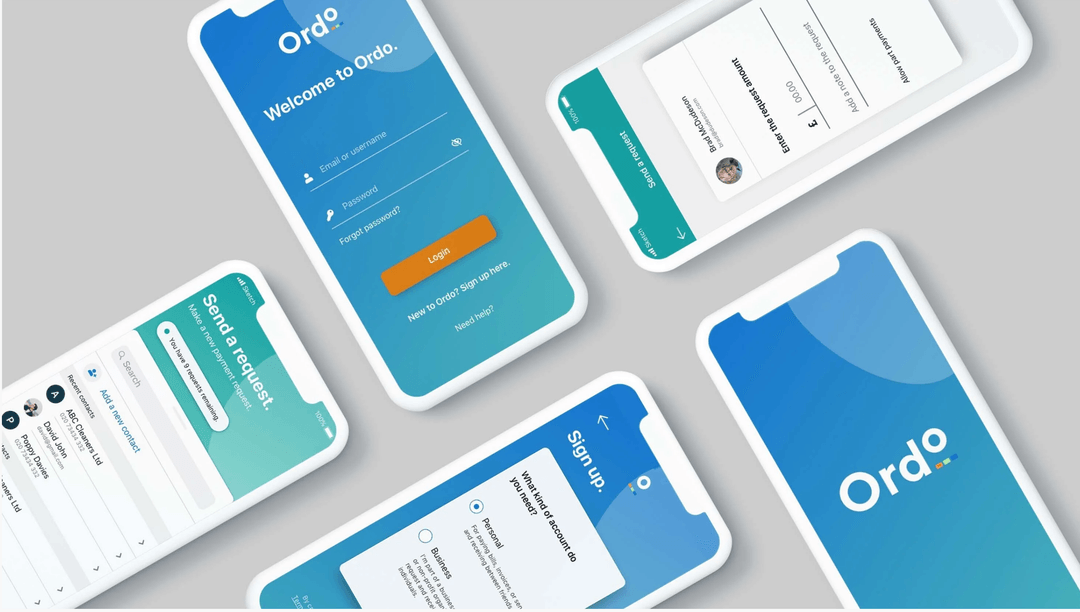
New to the market, Ordo is a groundbreaking payments service for the Open Banking era. Ordo is designed to make it easier for small and medium-sized enterprises to stay in control of their finances - whether they’re collecting customer payments, or paying suppliers.

Citi group created a design team to build advanced trading & wealth management features over the current banking apps to extend with features like asset tracking, cryptocurrencies, stock trading, wealth management, mortgage planning & general wealth advice.
.gif?w=540)
in 2017 I’ve worked with EY to develop a set of insurance focused customer vision journeys involving new technologies like fitness trackers, chatbots, AI and social rewards.

App for Warner Brother's Harry Potter franchise called The Wizarding World. An app that would unify all subbrands and be like an HP universe, a go-to place to find info about your movies, games, quizzes, video trailers and much more.
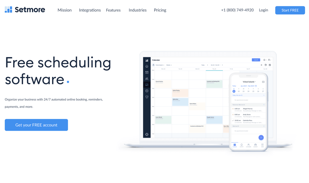
Setmore is part of Anywhere Works suit of products, an array of tools helping businesses to adopt cashless systems and manage customers easily.
![H&M Staff & Store Planner [AKQA]](https://assets.super.so/32c38527-42be-42cb-9c30-60e3398bb786/images/52e0271e-aae3-4aed-8664-090d86d21982/ezgif.com-optimize_(1).gif?w=540)
H&M Stafftool concept has been a digital swiss knife like tool, that would replace their paper catalogues which they are currently using to manage stores.
Oxe Fit Design system for their companion app, updates, create hierarchy, create a strategy for the line of devices like the XP1 & XS1

.gif?w=540)
Perfect Play is a training app designed for the consumer market made together with some of the main football couches and sport psychologists from Chelsea FC.
![Peerpoint V2 (Allen & Overy) [Biglight]](/_next/image?url=https%3A%2F%2Fassets.super.so%2F32c38527-42be-42cb-9c30-60e3398bb786%2Fimages%2F82c9ee5c-4532-4bbe-9fac-dd6347480656%2FScreenshot_2019-11-13_at_14.28.52.png&w=1080&q=90)
Peerpoint is a platform built by Allen & Overy to manage their recruitment in their law firm. As most of their employees are actually contractors with their own LTD, we had a specific persona model from where we built up the functions