About
RAC is a British automotive services company
In 2022 I’ve joined Futurice UK in order to help RAC optimise, structure and migrate to a unified design language of their organisation as well user testing and implementing new features.
RAC is a leading British automotive services company offering breakdown coverage and aside their main b2c customer flow, the business has created over the years multiple b2b journeys for brands like Kia, Renault, Dacia & Ford.
Scope
- Create a unified flow across b2b and b2c journeys by a common UX and Design System
- Test new features, tests & iterate their implementation in the DS
below are a selection of Jira tickets
1. Unified Design System (UDS)
Part of our scope was to create an unified design system across all journeys, so together with my colleagues (that were working on the Kia and Dacia flows) we set in place a figma file were we cross reference and match the same components. This to ease up time and resources for out developers teams, not needing to redo or create endless iterations in front end.

The design system is based on two parts, one would focus over the grids, text, icons, color & effects styles that we all use in the Figma. It was the consolidating piece in order to help us out as a team to move on the next step, component libraries.
Part two, as I’ve mentioned are components. Now Figma is pretty smart and we can create a vast array of combinations, it supports lots of variables in order to cover most of the instances.
We split the components as follows:
Atoms
Represent the smallest entity in UI elements and they can’t be broken down any further. They serve as the foundational building blocks of your interface.
Molecules
Are groups of atoms bonded together and are the smallest fundamental units of a compound. These molecules take on their own properties and serve as the backbone of our design systems.
Organisms
Are groups of molecules and /or atoms joined together to form a relatively complex, distinct section of an interface.


2. Features
FEATURES
Hide & seek button

How can we make people read and comply with regulations while still using the sticky button?

INTERACTIONS
Issue: How does the hide & seek fixed button will act when multiple mandatory fields are on a page?
The fixed bottom button is great for simple selectors like radio button cards and drop downs, however when we have pages with heavy text inputs that require inline validation may require some special conditions.
Below is an example of four inputs that for the sake of the example are just simple text (not require an email mask or number input).
The keyboard CTA’s play a role to go to and focus the next input field for ease of data introduction and they are named ‘NEXT’, except the last field that is named ‘DONE’ and it focus out the last field removing the keyboard and unveiling the bottom bar.
Bottom bar is dependable on the field validation, once text is entered the field border will be marked in green, once the text count is equal to 0 the field border changes colour to red. In order to show the bottom nav all fields need to be validated.

In the case that an input field is not valid, thus it’s marked as ‘red’ the button will be grayed out and tapping will scroll to the not valid field and highlight it.

FEATURES
Cover Level Page
Issues

Process

New components
Aside the new components we searched ways to revamp the whole page
Vehicle/person widget
One additional functionality is to tweak the number of vehicles or people when users change their cover level. Our hypothesis is that the Cover Level page will act like a comparison tool and this will drive more traffic, as people would want to add people later on.
The widget will work as a comparison tool, every time an user taps the
Choose Cover Page: Reduce white space on step/tighten up design []
In the second version, we have explored one idea that previously was prototyped and tested well to expand the selection cards with the second option.

The cards will support promo banners on top and will look like regular cards with extra iconography but once selected we can see the cover level options, for vehicles will prompt 3 options respective 5 for person cover.
Once users select one cover level you cannot go back to the previous ‘unselected state’ however users can select the other cover, minimising the previous selection (working as a toggle).
Ideally, selection will be stored, so for example if we first tap on the vehicles and select ‘2 cars’, further if we want to see what options we have on ‘Personal’ and choose a level when we come back the ‘2 cars’ selection will be remembered.
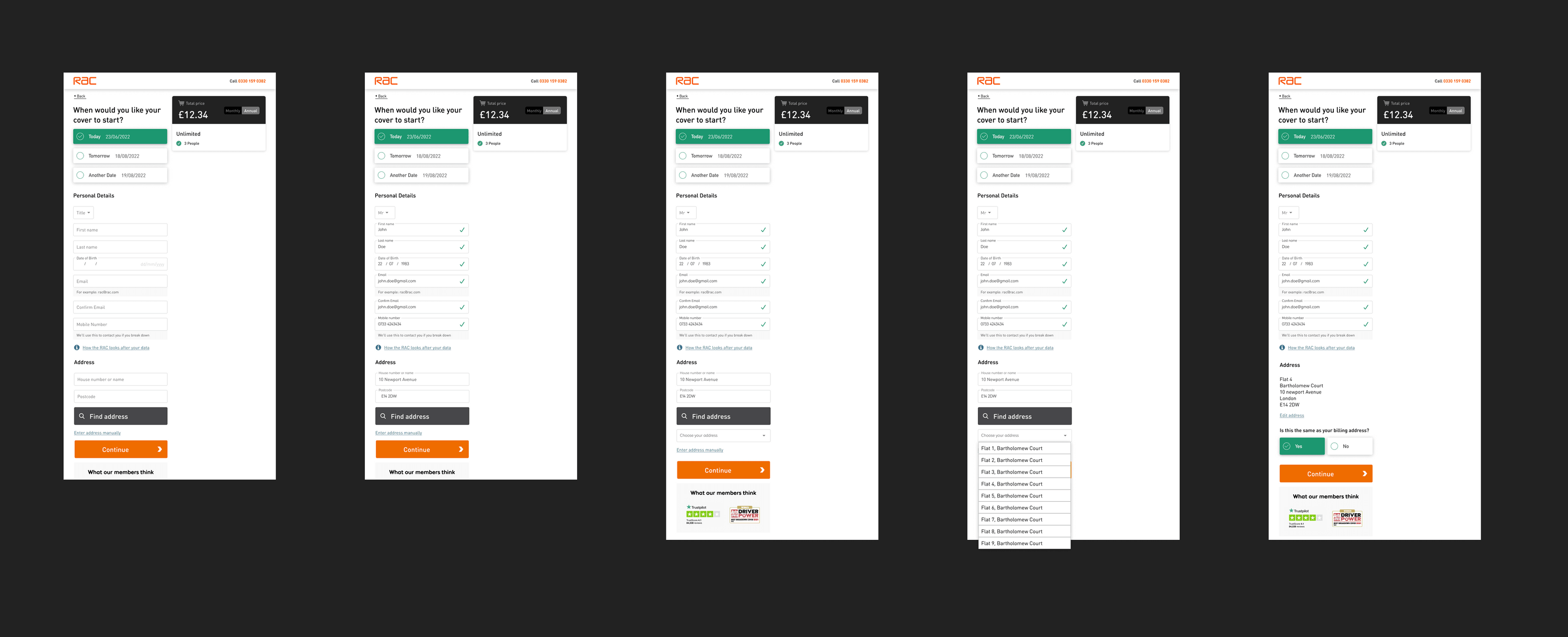
Combine Cover start date/Personal details/Address pages
The research phase was a key part of our work, We’ve looked over a series of services that tackle field validation on long pages in order to check what is feasible from the tech and multi-platform points.


Iterations
We came up withtwohipotesys
The aim was to create an elegant yet gfast data entry, similar with what products like Typeform and Jotform, in a step by step page like experience, while leaving the option to scroll, preview and have the degree of freedom. Because some of the entry fields may come as preselected and others would require an active decision we tried a couple of ways to tackle this in UX.
The first ‘advanced’ idea was to create a fixed bottom

The ‘Fixed button & next steps’ is the original idea involving a sticky button whom will reflect the validity of each section. The button will prompt next until all field are validated and then the copy will switch to continue.

Design
Mobile XS

Tablet M
Desktop XL

Scroll to error field
When adding lot’s of fields in one page, one main concern was the how potential uncompleted input fields that may be missed can create problems. One easy solution that is pretty common per our research was to create a feature that would scroll and highlight the invalid fields every time the bottom main CTA is tapped.
The fields will be shown in a sequential order and if we have multiple ones when you tap the keyboard ‘NEXT’ will chain to the next ‘invalid’ field. If we are done, the scroll will go to the bottom button in order to get to the next step.

Choose Cover Page: Add icons to the add-ons and make each add-on Q&A look like individual sections []
The issue of the redesign was that in the previous design users found the information too heavy and items too clogged out in the page. So we considered and auto scroll when an active selection is added but always keeping the scroll free, without an option to snap of paginate.

Desktop follows the same pattern as mobile and relies on the height of the page scroll, while elements like the price and dropdown widget remains fixed.

Type ahead
one of the

Choose Cover - Redesign Cover Level Tiles [DD-8755]
User Story:
AS A business
I WANT TO improve the presentation of the cover level tiles (and make them more closely aligned to the landing pages)
SO THAT potential customers have very clear and consistent messaging about the features included within each cover level
Acceptance Criteria
Wires still to be defined
Accordeons
One of the challenges of desktop was to avoid messing up the card height when an user opens several dropdowns. As a solution we implemented an open an close system, the white space underneath the dropdowns is equal to the biggest amount of text, as you expand another drop down the others will auto close.

Information redesign
[ add UI Design ]
The
Touch Map
The diagram shows the tappable areas of the card selector vs the space allocated to the dropdowns
VBM PBM Redesign
The task was to see what changes we could implement to increase conversion on the page by increasing the clarity of information. The hipothesys was that adding iconography,

Testing
In ortder to A/B test we
Iterations
Pop ups were taken in consideration, a spinoff from the current ‘Tell me more’ pop ups that try to cover both cover modes.

Bullet points

Expandable cards were taking into consideration, the behaviour is to expand the card one way without using any use of dropdown or toggles.

We selected a combination of ideas for our test runs with iconography


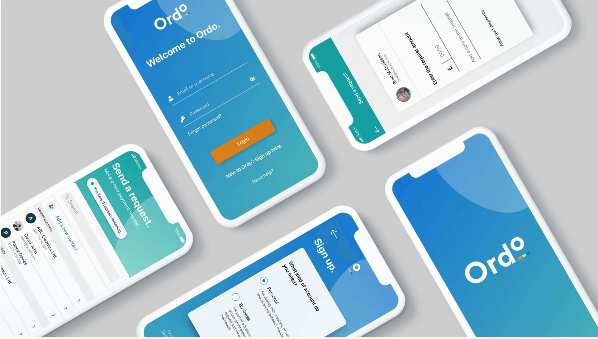
New to the market, Ordo is a groundbreaking payments service for the Open Banking era. Ordo is designed to make it easier for small and medium-sized enterprises to stay in control of their finances - whether they’re collecting customer payments, or paying suppliers.
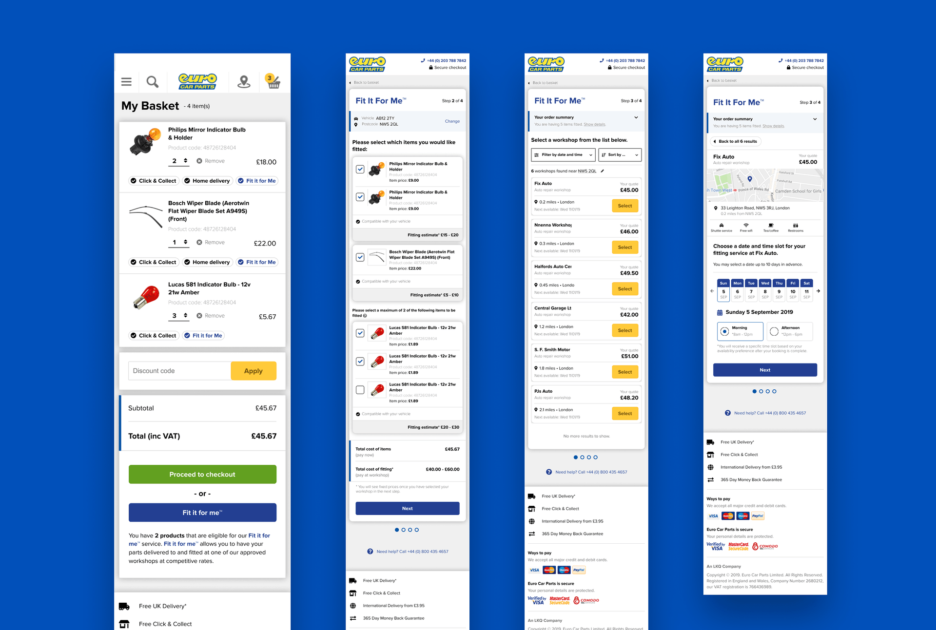
Create “Fit It For Me” service from scratch! A handy service, which lets you buy a selected part, and have it installed by one of our trusted garages

App for Warner Brother's Harry Potter franchise called The Wizarding World. An app that would unify all subbrands and be like an HP universe, a go-to place to find info about your movies, games, quizzes, video trailers and much more.
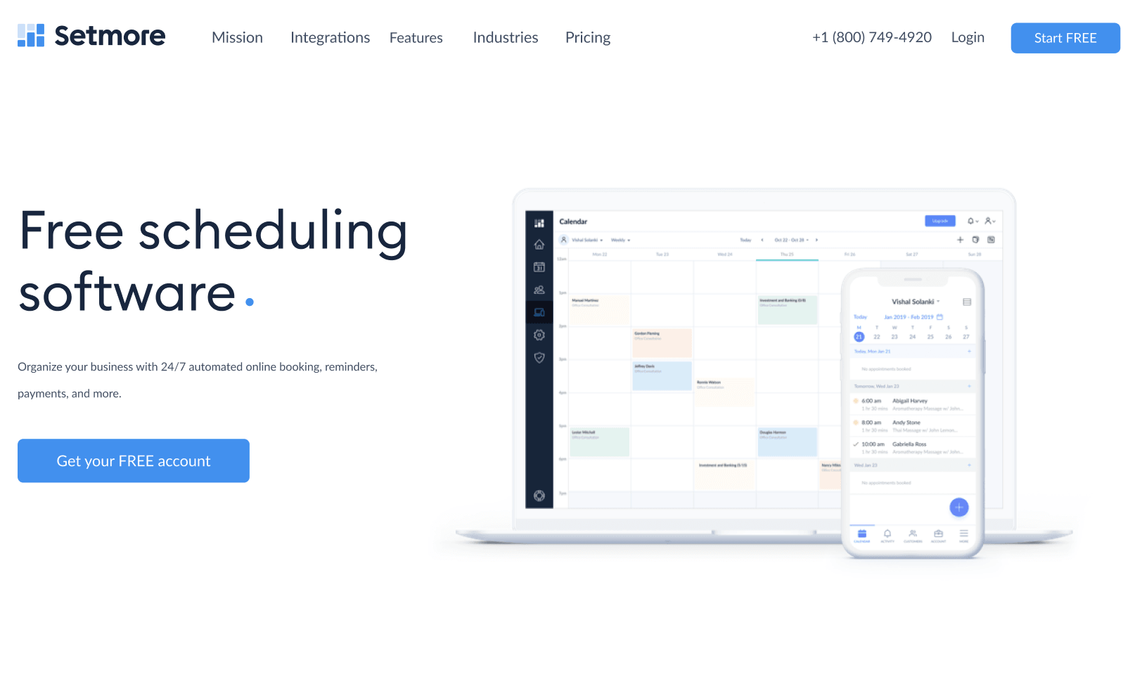
Setmore is part of Anywhere Works suit of products, an array of tools helping businesses to adopt cashless systems and manage customers easily.
![H&M Staff & Store Planner [AKQA]](https://assets.super.so/32c38527-42be-42cb-9c30-60e3398bb786/images/52e0271e-aae3-4aed-8664-090d86d21982/ezgif.com-optimize_(1).gif?w=780)
H&M Stafftool concept has been a digital swiss knife like tool, that would replace their paper catalogues which they are currently using to manage stores.
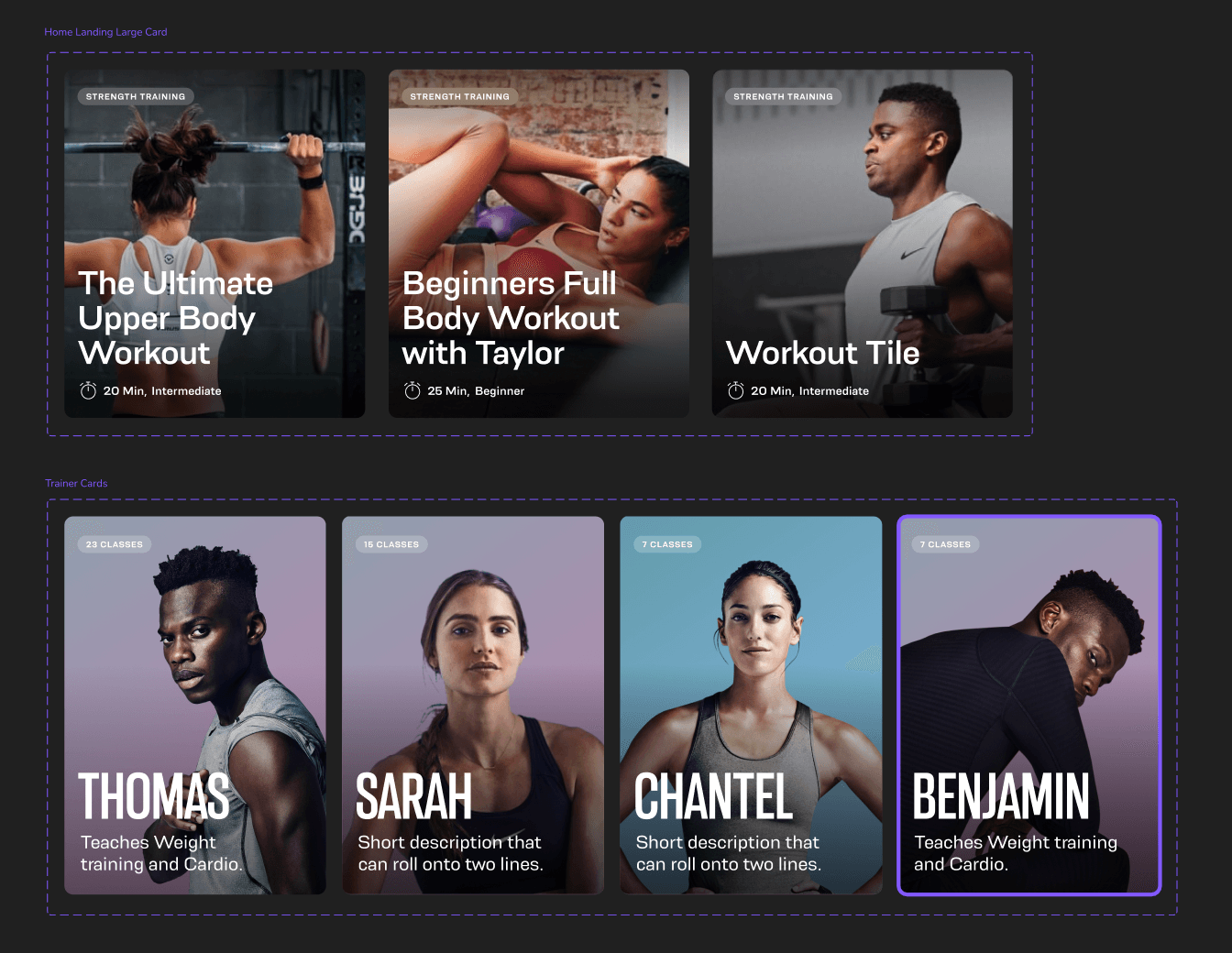
Oxe Fit Design system for their companion app, updates, create hierarchy, create a strategy for the line of devices like the XP1 & XS1
.gif?w=780)
Perfect Play is a training app designed for the consumer market made together with some of the main football couches and sport psychologists from Chelsea FC.

