Citi group created a design team to build advanced trading & wealth management features over the current banking apps to extend with features like asset tracking, cryptocurrencies, stock trading, wealth management, mortgage planning & general wealth advice. I've worked with an incredible team bringing these features to life, from user flows, wireframes, UI design to interactive prototyping and testing.
Intro
Following I will try to layer the process and kind of the step by step pace that helped us to concretise the core features. The project was much more complex that is presented here, we worked on 3 core personas corresponding to Citi's main customer base.Because some data might be sensitive, some of the entries in this presentation are obfuscated according to our NDA agreement.
Team
For this projects I had the chance to work again with some of my past colleagues as long as meeting new cool ones! Thanks Angie, Kevin, Glen, Janina, Mario, Ji, Dani, Rishi, Sophie, Alberto as long as everyone from W12 crew. In order to blend in we've tried to use our Citi Bank hangouts backgrounds, like this one! 😂
We were 8 people team each
1 x project Manager
1 x Design Lead / Manager
3 x Product Designers (including me)
2 x Motion Designers
As a product designer part of the Citi FoT team our work started from
- Creating the UX and integrating the job spec in the broad app architecture
- Visual Design, presenting designs to the client, solving feedback from Invision, adjusting over feedback
- Prototiping/Interaction - Each member was encourage to prototype their design, explain micro-interaction and assist in testing
Tools & Process
We were fortunate to work in an agile team with the
Information Architecture
Information architecture phase was an interesting piece to work on, the app was designed to sit over their current banking app and needed to work with their current design team to learn how the pieces are structured and how can we branch up new features over their taxonomy.

Sketch Design System
(migrated later the whole team to Figma:)
Primarily we used Sketch as our design tool to match our client environment then we upgraded everyone on Figma.
As a team we used a unified design system in sketch stored on a shared drive. We used all to make changes and push updates to components, see that we're using the same headings and color schemes.


Motion Guide
Additional to the design system that focused more on designers, we created a motion guide to serve everyone onboarding the team our methods to tackle motion. Things like ease in & out, bounce, animation styles as long as the motion scripts were captured in our key doc. This helped us as a team, developers and clients to understand our animation style.
Invision
We used invision to quickly mockup and prototype and also capture comments from the client fast and effective
Prototyping
For this project we've exclusively used Protopie for prototyping, user testing, interactions and micro-animations. Before we used to work with Principle, Framer and Flinto, however the nature of the project and our distributed team, mostly working from home made us rethink our tool stack for efficiency.
Advantages of Protopie are clear:
- cloud based
- lots of privacy options
- custom scripting
- Webapp (don't need to bother around versions)
- OS agnostic
- Endless solutions to tackle stuff
- overall a good tool to communicate ideas to our clients
...and a couple of downsides:
- longer dev work
- a bit complex to update designs repeatedly
- loads harder when we have more than 10+ screens


/w=3840,quality=90,fit=scale-down)

Personas
We profiled the page with our 3 personas in mind and two modes: basic & advanced. each section would be fully customisable.

User Testing
Every 2 weeks we had user testing sessions for each feature. These gave us helpful insights about how different users interact with our designs, see what potential blockers can pop out and check visibility of each functions. User testing where good to understand whet patterns our customers got used to and what other investment apps like Robinhood, Freetrade, nutmeg etc are currently using.
Crazy 8 workshop sessions
Each member of the team was encourages to facilitate workshop sessions by rotation. These sessions are really valuable as it encourages everyone from the team to participate to ideate designs and everyone is included! From designers, of course to copyrighters, developers, PM's.

Features & Sections
Following I will try to layer here some of the main sections of the app we've worked. The project featured lots of stuff, however
Stock Page
The Stock detail page’s purpose is to help customers make informed decisions about what to trade and to help them have an overview of any existing assets they own.
It is imperative that the page is not only concise and informative but engaging and entertaining to digest and relate to.


Analyst Ratings
We included the number of analyst ratings and worked on two different views for the analyst comment section.
Option 1: Comments from a Company level
Option 2: Comments from Analysts

Company Level
Comments would be displayed from a company level (Citi Group, Bank of America, Credit Suisse etc.)
Users can select to see buy, hold or sell comments. The one with the highest rating will be selected by default.

Analysts
Comments would be displayed from single Analysts.
Users can select to see comments grouped by company level (Citi Group, Bank of America, Credit Suisse etc.)

News
We refined the way the user interacts with the News Section, exploring the idea of adding background video related to the the news piece.
We added a step in between the headline and the full story, giving the user more context to decide either to keep reading or go back to the full stock page.

Level 2
For Level 2 we need a solution which is flexible to both our current and future requirements but ultimately is an interesting, engaging interaction. The first iteration we have here is an overlay which acts as a scalable container for larger lists.
x


Asset detail - Advanced view
We have also been working on the Advanced view of the ‘Asset detail’ page. Specifically this means looking at the extra detail that this particular view would provide.


Trade flow
Trade flow is the user flow that follows an user as he trades his shares

Single buy
First pass design for a single item buy. For this scenario the start point is a stock detail page and there is an emphasis on keeping the flow as simple and clean as possible.

Multiple items buy
A more complex flow involving a larger basket experience where multiple items are added and purchased. Starting point is selecting items from a watchlist that the user follows.

We’ve made changes of order details part more outstanding and easy to convert between sell by dollars and sell by shares in one click. Also, to make 'order type' dropdown button more exposing to allow an intuitive way to look at it, we’ve relocated to the middle of the screen.
We also updated confirmation page UI components to show selling details incl. tax data.

First pass look at sell approach for ‘Make a trade’. The scenario is selling a single item from Stock details and mirrors the ‘Buy’ approach in its simplicity.


Compare Stocks
Compare is a feature to be able to list side by side two or more stocks and list a couple of variables below in kind of a spreadsheet format. Easy to represent on web but quite challangin to make it work on a small portrait screen. When more than two stocks are added to compare you can highlight each one by swiping the columns below.


My Investments

My Portfolio Investments
As part of a move to mentally shift the way customers approach how the organise their funds, we would like to reserve the term Portfolios for a customer’s “bundle” of assets.
This allows them group assets into custom Portfolios that can also have a goal attached to them.

A closer look
We are able to dive deeper into analysing a customer’s assets across the spectrum and view it through different lenses.
The categories are available to swipe through across the top and we always offer suggestions to diversify and reduce vulnerabilities as a result.

Portfolios, Goals & Holdings
Customers are able to create custom portfolios to help group their assets together.
Goals can also be attached to portfolios which help customers keep track of their goals.
You are also able to view all holdings as a list and filter the views accordingly.

Stock Discovery
The Discover section’s purpose is to inspire customers to invest when they’re not sure what they’d like to invest in and where to start.
The page starts with suggestions that are most personalised to the individual customer based on their investment attitudes and interests and then becomes more generic as they scroll through the page.

My Portfolio vs Discover
The My Portfolio* section gives the user an overview of existing investments' performance and a detailed breakdown of all holdings.
The Discover section provides the user with recommendations and insights to guide future investments.

My Portfolio
My Portfolio - Overall performance of the users investments and relevant insights.
Portfolio Breakdown - Breakdown of different investment types (stocks, funds, crypto, commodities) and sectors.
Your Investments - Individual holdings for each asset class.

Discover
Picked for you - Recommendation based on the user profile/preferences. These can be edited.
Clark’s balanced profile surfaces investments that can diversify his portfolio and lower his overall risk.

Discover
Picked for you - Based on the users persona, the system recommends Stocks and Experts which match their persona
Products you love - Recommendation based on spending habits

Discover
Investment strategies - We want to empower the user by giving them insides to different investment strategies
News - Breaking news that could affect markets or investments
Popular this week - Current popular investments

Discover
Collections - Explore using thematic tags (e.g Citi loves, eco, ethical etc)
IPO - New securities that are becoming publicly traded
Sectors - An overview of all GICS Sectors

Prioritising Personalised Content
We prioritise personalised insights for the user at the top of the discover page. As you scroll, the content becomes less about personalisation and more about surfacing broad entry points which the user can action to drive their own exploration.

Guiding the user
In the customer-driven section, we can still recommend options we think are the best fit for the user. This maintains a sense of guidance from Citi even when surfacing lots of options.

Picked for you
The picked for you section surfaces personalised content and recommendations. Clark’s balanced profile surfaces investments that can diversify his portfolio and lower his overall risk.

Investing round ups
The round up component identifies recurring transactions that the user often performs, and provides a quick interaction to invest spare change from these purchases into the relevant stock.

Coach marks
Integrated coach marks sit within important sections and only appear when the user enters the section for the first time.
They introduce important features and functionalities.

Clay
Clay is a personal assistant that understands customers’ specific needs nudging them towards the next best action.
Clay can offer help in tricky situations, offer suggestions that could be fun to complete and reminders on important events and actions.
Clay gets smarter the more it learns about its customer.

Search
The user can use search to find specific investment options.
If they clicked into this section without knowing exactly what they're looking for, we would link them to the discover section.

We follow through to more generic news items that allow customers to browse through various sections of interests. Items that are more aligned to the customers’ interests are highlighted to the customer so they know they’ve been picked for them.

Updates after testing results:
- Products you love: Copy is more explicit that we are encouraging you to invest based on spending habits.
- Inv. Strategy: Made the end more meaningful leading to in-depth info, more learning content and action
- Thematic investing: Copy update + engaging tile design
- World News: More engaging design


Prototype
Stock Search
Stock search essential for finding your prefered stoks and do research. Search within the Invest tab allows the user to find content about the different types of investment assets, such as stock, funds, crypto, and commodities.
Local search (eg. Invest Search) Sits in the individual focus sections and defaults to search items within that focus. For Invest it allows the user to find content about the different types of investment assets, such as stock, funds, crypto, and commodities.

Global search
In the global search scenario the user carries out a search across the entirety of the product. It will return results from all sections within the parameters defined by the user. This will initially give more depth to the results at the cost of being more general in the results returned.

Invest search
The invest search is much more focused in that it is targeted solely on the invest section. It will return results for stocks, cryptos, funds, ETF’s and any other useful info that will help inform users investing decisions.
The assumption is that generally users will be searching for something specific.

Contextual information
The results will be clearly organised with the information steadily becoming more focused as the user types more characters into the search field. Once the search becomes more specific we can start to display information such as news and community content.

Advanced users
Our recommendation is that for basic users we don’t show a trade button at the search card level. This is because we believe that default users (new to investing) are likely to want to see more info about a stock before investing their money.
For the more seasoned investor there is a rationale for having a trade button visible at that higher level. We have included an option where this could be added.

The default view will surface popular search terms as well as also dive users to content they have viewed recently.
Further down we also allow users to access a more “traditional screener” that will reveal a list of all available investments assets in a large list that can be filtered down.

Results will update upon entry of the first character to surface any matching “Stock ticker” and be organised in order of relevance to the search term.
Results are grouped to sub categories: Stocks, Crypto, Commodities, Other (will include news and article content relevant to the search term).

The general consensus towards a Quick Buy/Sell button on Search was lukewarm however the Swipe to Save to Watchlist was well received... but we thought perhaps we can push it further. What if we created one interaction that allowed you to Buy/ Sell or Save any stock tile at any point in the product experience?

Default page provides personalised and curated content based on users' behavioural data. Suggested tags will be reflected according to the user's search flow.


Collections & Watchlist
In an app with so many bits and pieces we envisioned a way to collect/bookmark in order to review later.
Allow customers to save content and investment assets to a Watchlist area and also to create custom lists of their choice.
Offer insightful lists based on what they’ve saved and inspire them to discover new investments.

Allow customers to save content and investment assets to a Watchlist area and also to create custom lists of their choice.
Offer insightful lists based on what they’ve saved and inspire them to discover new investments.


Xray
X ray (name due to be reviewed) is an area in the app where an user can visualise their portfolio over a series of parameters like Sectors, Type, Performance, Geography & Climate Impact. Each section is designed to be a tab with the possibility to fully customise the order and autosave for future use.


Portfolio builder
Customers now have an option to browse stocks, funds, crypto or commodities picked for them or are able to let us help them build a portfolio.
The flow leads to a chart where we suggest customised portfolios aligned to their needs, goals and interests whilst taking their risk profile into account.


My Citi (Dashboard)
Digest
The weekly digest holds key actions and interesting insights specific to our customer and spans across the entire of their wealth whether it be daily banking, credit cards, savings, mortgages or investments.

Userflow

Profile
Overview of the Profile page section.
The initial design work has focused on the hierarchy of the section and the various use cases that someone may need from a profile section.

The profile page is a space where users can see their personal information (including their Money personality), learning progress, achievements and Citi perks. Users can also view and edit their profile settings. We want this page to be more than a standard profile page by offering a more personalised, exciting experience while also fulfilling the needs of a profile page.

Other Projects

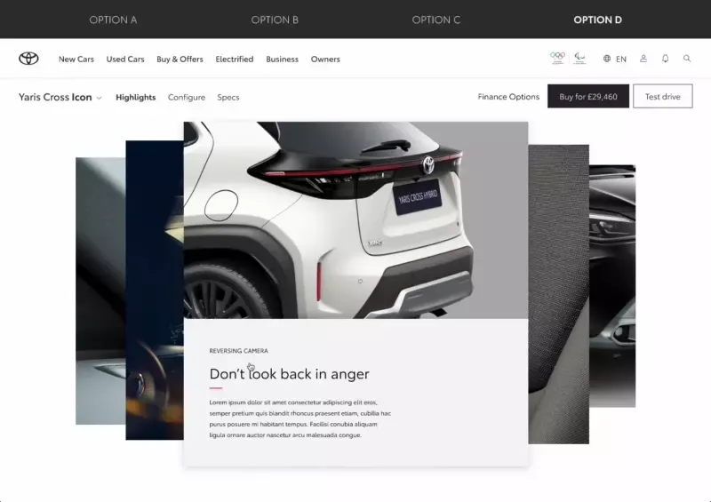
In 2022 I’ve joined Futurice UK in order to help RAC optimise, structure and migrate to a unified design language of their organisation as well user testing and implementing new features.
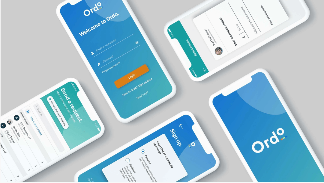
New to the market, Ordo is a groundbreaking payments service for the Open Banking era. Ordo is designed to make it easier for small and medium-sized enterprises to stay in control of their finances - whether they’re collecting customer payments, or paying suppliers.
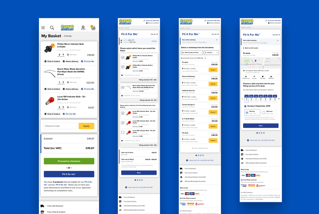
Create “Fit It For Me” service from scratch! A handy service, which lets you buy a selected part, and have it installed by one of our trusted garages
.gif?w=540)
in 2017 I’ve worked with EY to develop a set of insurance focused customer vision journeys involving new technologies like fitness trackers, chatbots, AI and social rewards.

App for Warner Brother's Harry Potter franchise called The Wizarding World. An app that would unify all subbrands and be like an HP universe, a go-to place to find info about your movies, games, quizzes, video trailers and much more.
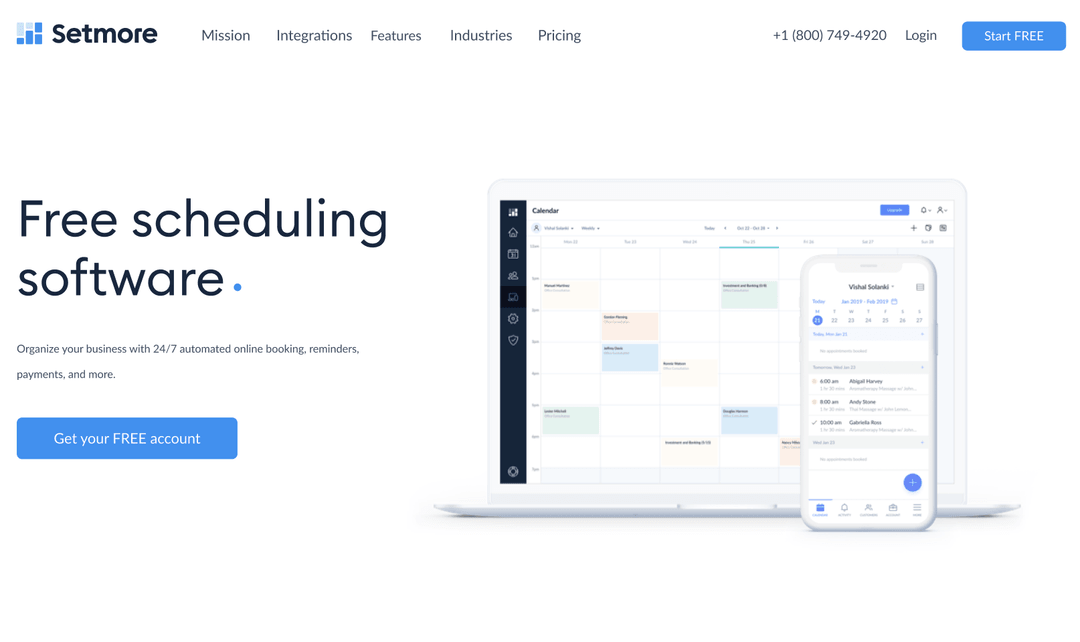
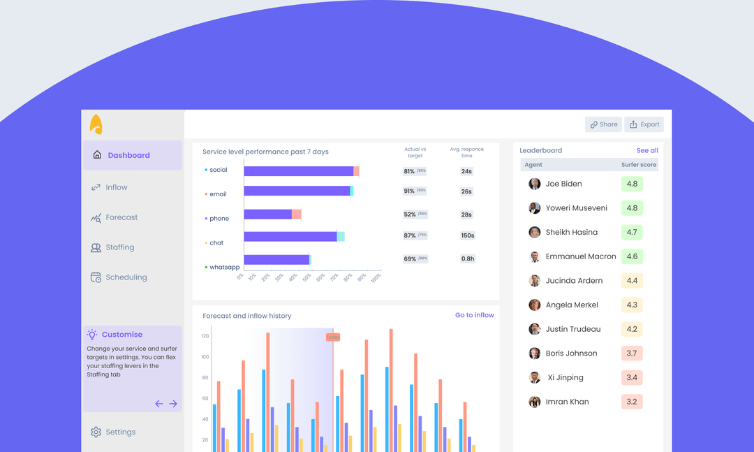
Setmore is part of Anywhere Works suit of products, an array of tools helping businesses to adopt cashless systems and manage customers easily.
![H&M Staff & Store Planner [AKQA]](https://assets.super.so/32c38527-42be-42cb-9c30-60e3398bb786/images/52e0271e-aae3-4aed-8664-090d86d21982/ezgif.com-optimize_(1).gif?w=540)
H&M Stafftool concept has been a digital swiss knife like tool, that would replace their paper catalogues which they are currently using to manage stores.
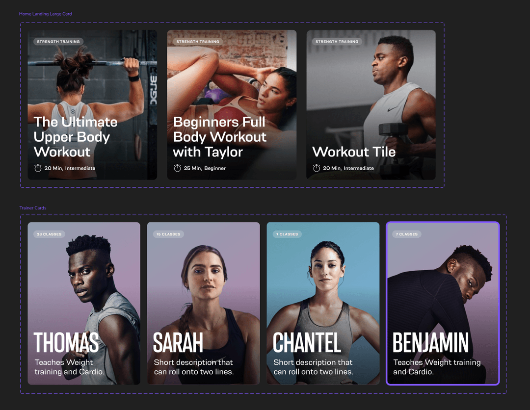
Oxe Fit Design system for their companion app, updates, create hierarchy, create a strategy for the line of devices like the XP1 & XS1
.gif?w=540)
Perfect Play is a training app designed for the consumer market made together with some of the main football couches and sport psychologists from Chelsea FC.
![Peerpoint V2 (Allen & Overy) [Biglight]](/_next/image?url=https%3A%2F%2Fassets.super.so%2F32c38527-42be-42cb-9c30-60e3398bb786%2Fimages%2F82c9ee5c-4532-4bbe-9fac-dd6347480656%2FScreenshot_2019-11-13_at_14.28.52.png&w=1080&q=90)
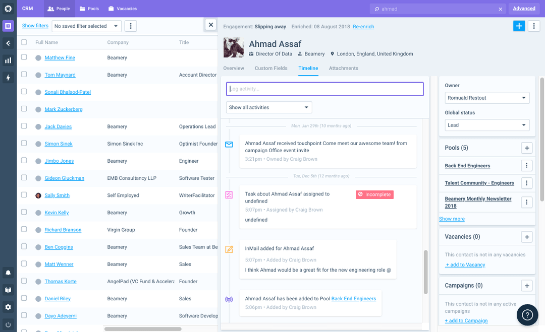
Peerpoint is a platform built by Allen & Overy to manage their recruitment in their law firm. As most of their employees are actually contractors with their own LTD, we had a specific persona model from where we built up the functions

